Visual issue: buttons on top of progress bar
Submitted by otacke on Tue, 09/19/2017 - 09:56

Forums:
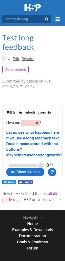
There may be an issue with JoubelUI or H5P-Question, probably CSS related. I have not yet looked into it. If the horizontal space is small and the feedback message long enough to cause a line break, then the buttons may be put on top of the progress bar.
- Steps to recreate the bug
Have a look at https://h5p.org/node/117359 or create your own content type with a quite long feedback message and then make the horizontal space smaller, e.g. by resizing the window. - Platform you're using: Drupal, Wordpress, Moodle (version number would be helpful as well)
Drupal 7 in the case of h5p.org, also found on Wordpress 4.8 - Mobile or Desktop
Desktop and mobile (depending on screen width) - Browser: Chrome, Firefox, Safari etc
Confirmed on Chrome, Firefox and IE (Desktop) and Safari (mobile) - H5P plugin version
Whatever you are using on h5p.org, latest version of Wordpress plugin - H5P content type version
e.g. the latest version of Multiple Choice or Fill in the Blanks - Screenshots if it's a visual problem
please find a screenshot attached to this post
Attachments:
icc
Wed, 09/20/2017 - 09:38
Permalink
Thank you for reporting this,
Thank you for reporting this, I've created an issue for getting it fixed: HFP-1523