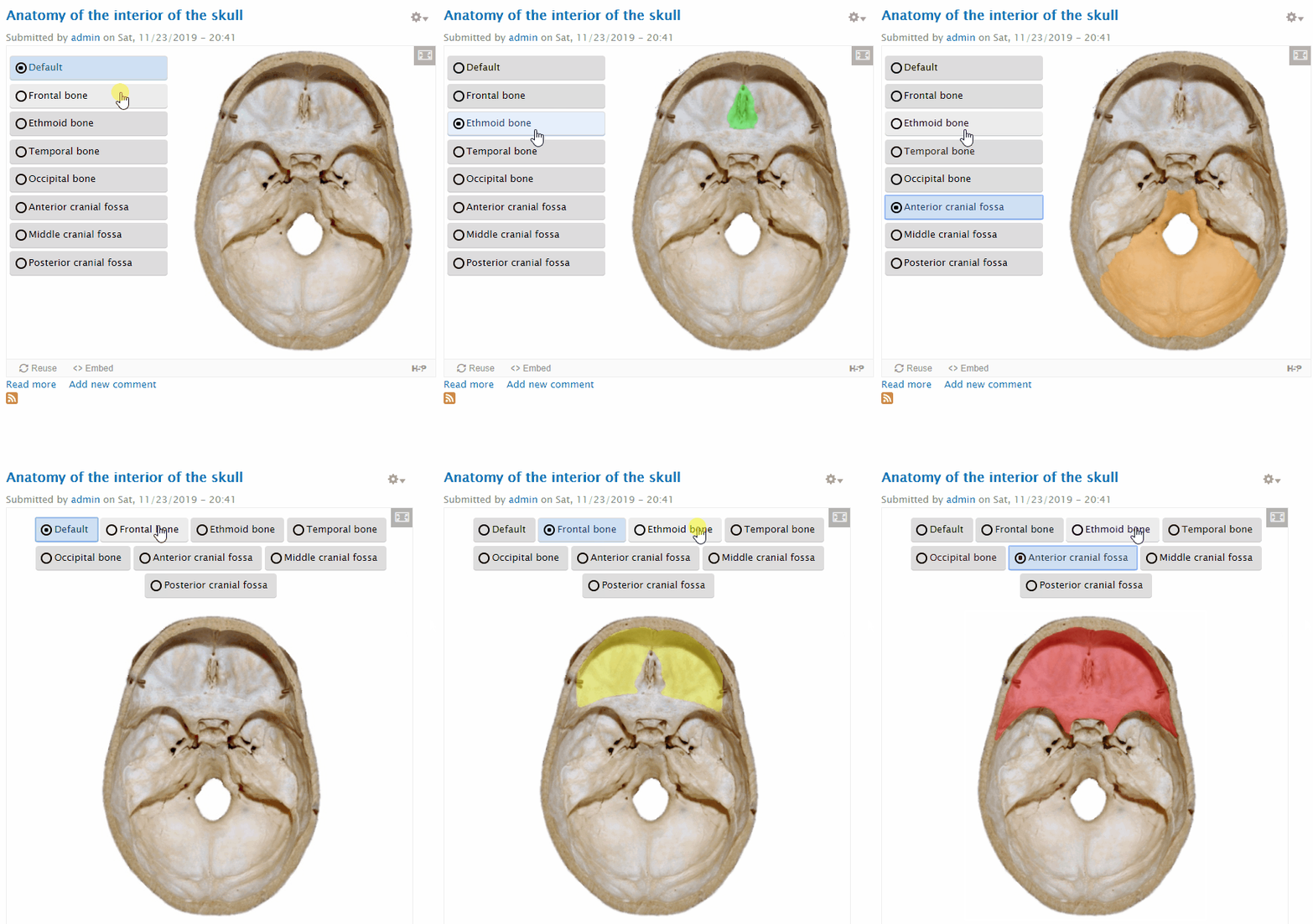
H5P.LinkedImageSwap
New content type created which basically associates an image with a button - see below:
- Works with mouse or (arrow/space/Enter) keys
- Responsive to smaller screens by moving buttons above images
Code is here: https://github.com/msdlt/h5p.LinkedImageSwap

I can't work out how to use the FontAwesome library for the radio button icons so these are curently css - see: https://h5p.org/comment/31040#comment-31040
Long-term, it would be much better to improve the image hotspot drawing tool to support polygons and then draw filled polygons on images inside H5P. But this 'low-tech' approach will enable us to convert hundreds of image-based interactions like this in our pre-clincal medicine course.
Many thanks
Damion

falcon
Thu, 11/28/2019 - 10:24
Permalink
Hi there,Thank you for
Hi there,
Thank you for sharing your work with the H5P Community! The Core Team is as usual very busy. I think at best we'll get to the full review in February. We will however be able to help you with FontAwesome and can also suggest other design improvements before then if you're interested?
Here is the review issue: https://h5ptechnology.atlassian.net/browse/HFP-2889
otacke
Thu, 11/28/2019 - 14:52
Permalink
Hi theotherdy!I left you some
Hi theotherdy!
I left you some comments on github. Should help you to prepare your code for the review.
Best,
Oliver
icc
Tue, 04/28/2020 - 15:39
Permalink
I've reviewed the code and
I've reviewed the code and tested the content type. The content type does seem very useful but there are some bugs and improved that should be worked out in order to ensure optimal quality for it:
1. The code looks OK, but it requires some cleaning up. There is a lot of lines commented out and some lines that run but don't really seem to do anything, for example, the getWidthOfWidestLink() function which sets the self.widestLink that isn't used, and linkButtonId which isn't used. It's probably best to keep this sort of stuff on an experimental branch or similar.
2. The first time you visit the content you don't see any images because the content is not resized after the images are loaded. There needs to be something like .on('load', function () { self.resize(); }); for all the images to ensure that they are visible after being loaded. This can be reproduced by disabling the browser cache.
3. There is no scaling of the images. It appears the images must be perfectly scaled before uploading to fit all screens which will make this tool though to use for many authors. I would recommend having a set size for all images, e.g. max-width: 100% and height: auto. This is reproducible by uploading an image that is larger than the content, e.g. 1920x1080. Also, smaller images with a different ratio are often cropped.
4. Accessibility: The keyboard controls are OK but the content itself does not appear too useful for those relying on readspeakers. This may be OK for this type of content type but I would like to see some improvements: Some instructions and/or a label to the radio buttons. Announcing the changes on the page when toggling the different radio buttons - it's not apparant that the image was swapped out.
Apart from that, this is looking very promising and we cannot wait to have this released.
theotherdy
Wed, 04/29/2020 - 17:40
Permalink
Thanks @icc for the very
Thanks @icc for the very helopful comments. I'll address them and get back to you.