Drag and drop not responsive
Submitted by lingvemulo on Sun, 12/10/2017 - 23:12
Forums:
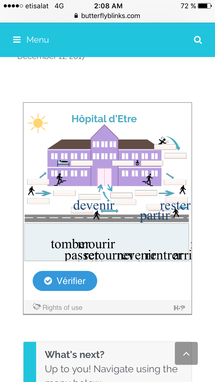
Hi - I've created a drag and drop activity, and it works perfectly on the desktop, but not on the iPad or the iPhone. The drop zones don't stay in place, and the text also changes from the default font to a serif font... Odd.
The activity IS responsive if I resize the browser window on the desktop, so I'm not sure what's going on. (The font is minuscule, though, and I'm still trying to work out how to get my changes to take in my h5p mods plugin...)
Your insights would be appreciated! (I've attached the file, as well as screenshots, in case it helps.)
H5P file:
Content types:
lingvemulo
Sun, 12/10/2017 - 23:16
Permalink
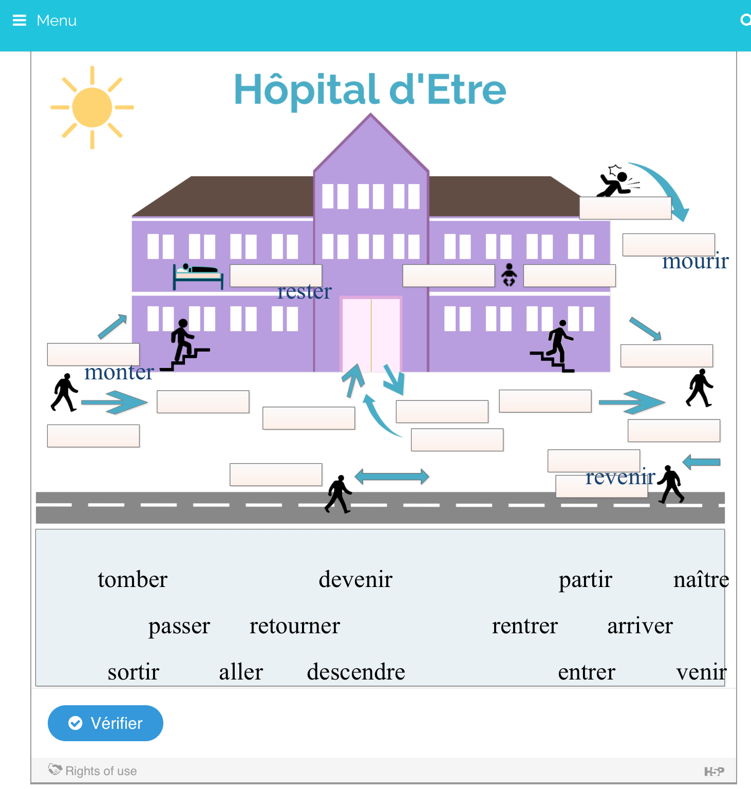
Image of a working version
This is a screenshot of what it looks like on the desktop.
BV52
Mon, 12/11/2017 - 08:46
Permalink
Hi lingvemulo,Thank you for
Hi lingvemulo,
Thank you for the information and attached files. I am unable to reproduce the issue using my ipad (Chrome & Safari browsers). Would it be possible to share the site so that we can check it?
I've attached screenshots of the test and I've uploaded your content here.
-BV52
lingvemulo
Mon, 12/11/2017 - 09:32
Permalink
I messed it up, fixed it, but still have a problem
Hi - After checking out your examples, I realized that I messed something up by playing with css - I couldn't get any of the changes to take yesterday, but this morning (caches flushed) I apparently did manage to change the font size. I admit that it's a bit confusing to use the h5p mods plugin, since I can't see any of the changes in my normal css editor...
In order for this activity to be feasible on all platforms, however, the words to be dropped need to be big enough to see... :-)
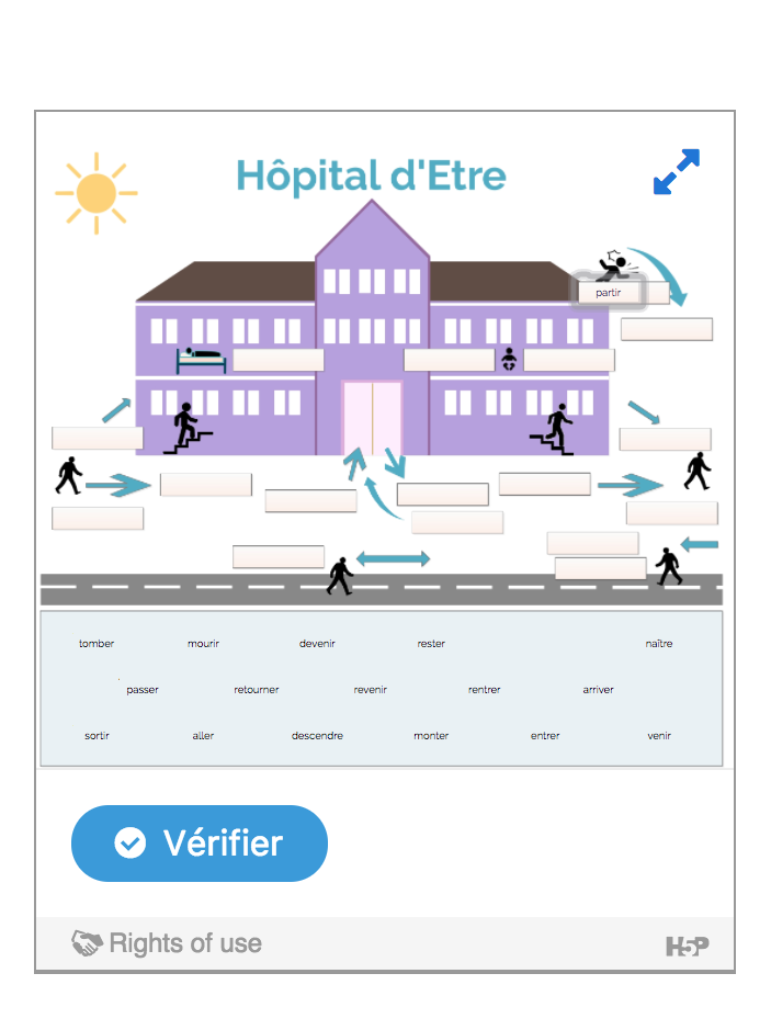
Here's the live version on my site: https://butterflyblinks.com/hopital-detre-glisser-deposer/. I removed the custom css, so it now works as intended, but I actually have no idea how to get the font size of the draggables to be big enough to see.
Thanks for your help!!
falcon
Thu, 12/21/2017 - 15:09
Permalink
Hi, I'm sorry you haven't
Hi, I'm sorry you haven't gotten a faster answer. Drag and drop isn't fully responsive, and it can't be made responsive either. If the words are small on a wide screen they will be unreadable on a smaller screen. If they were to be made bigger relative to the background on a smaller screen we would often ruin the layout/idea for the task. Only way to fix this is to use bigger draggables on big screens or use other content types.
otacke
Fri, 12/22/2017 - 12:18
Permalink
Just a thought for the
Just a thought for the community, maybe someone is looking for a coding/UX design challenge: In interactive video, the labeled buttons become small buttons when the available space shrinks too much. Something similar might be implemented for Drag and Drop. As a content designer, you could allow to switch the task to a different user interface automatically. This could be feasible unless the background image plays an important role for solving the task.
lingvemulo
Fri, 12/22/2017 - 12:37
Permalink
Thanks
Thanks for confirming what I suspected about the responsiveness. I'll just warn users that they have to have exceptionally good eyes and exceptionally tiny fingers if they want to do this exercise on a phone! Lol. And, of course, work on finding another way to do this.
It's so hard to make "game-y" things responsive... including crosswords, hangman - and yet if we could find a way it would revolutionize what we (teachers) can offer our students...
thomasmars
Tue, 01/02/2018 - 11:45
Permalink
Indeed, good ideas for
Indeed, good ideas for solving these kind of issues are always welcome :)
melihkaratas
Sat, 10/06/2018 - 22:43
Permalink
The toolbar
Hi, I don't see The toolbar allows you to insert. Pleas help me
Thank you
BV52
Mon, 10/08/2018 - 08:04
Permalink
Hi melihkaratas,In order to
Hi melihkaratas,
In order to give your bug report the best chance of getting answered, please include the following information:
The more information you provide, the quicker the community will be able to fix it and the quicker you'll have a working solution!
-BV52
Juho
Thu, 11/08/2018 - 14:01
Permalink
Drag n drop responsive
Hi, You can make it to work on different devices by creating different content for phone, pad, laptop and desktop. Then just hide or show with css @mediaquery.
BV52
Fri, 11/09/2018 - 03:50
Permalink
Hi Juho,Thank you for the tip
Hi Juho,
Thank you for the tip :-)
-BV52
Atbin
Tue, 01/24/2023 - 01:41
Permalink
Drag n Drop on iOS device/browser
Hi,
Regarding the Drag n Drop responsiveness, on 'Moodle' platform (3.11+) we noticed using an iOS device and browser (iPad/Safari), the drag and drop text element can not be dragged or moved around.
RESULT: The text object does not move when using an IOS device such as iPad. However, using a computer/browser, the text object can be moved around using the mouse.
Thanks,
BV52
Tue, 01/24/2023 - 17:18
Permalink
Hi Atbin,Would you mind
Hi Atbin,
Would you mind testing if you will encounter the same issue here: https://bv-demo.h5p.com/content/1291860203487749879
=BV