Semantics Definition (semantics.json)
This document describes the library semantics definition for H5P libraries. It consists of an introduction to the semantics themselves and a listing of the available semantic types and attributes.
What is semantics?
Library semantics defines the input values accepted by a library upon initialization. It ranges in complexity from non-existent for libraries that are not configurable, to deeply nested semantics objects and lists for libraries that are highly configurable.
The semantics are used to generate the generic editor for H5P libraries. The editor parses the semantics and generates a form containing fields for all available options for the library.
Semantics is also used to validate H5P content when shown to make sure the content inserted into the runtime JavaScript is valid.
The semantics are defined in the file semantics.json located in the library root folder.
Semantic types
There are a number of semantic types available.
- Basic types: text, number and boolean
- Container types: group and list
- Complex types: select, library, image, video, audio and file
The below matrix lists all semantics types and all supported attributes.
| type | text | number | boolean | group | list | select | library | image | video | audio | file |
| name | x | x | x | x | x | x | x | x | x | x | x |
| label | x | x | x | x | x | x | x | x | x | x | x |
| description | x | x | x | x | x | x | x | x | x | x | x |
| optional | x | x | x | x | x | x | x | x | x | x | x |
| default | x | x | x | - | - | x | x | - | - | - | - |
| importance | x | x | x | x | x | x | x | x | x | x | x |
| common | x | x | x | x | x | x | x | x | x | x | x |
| widget | x | x | x | x | - | x | x | x | x | x | x |
| widgets | - | - | - | - | x | - | - | - | - | - | - |
| field | - | - | - | - | x | - | - | - | - | - | - |
| fields | - | - | - | x | - | - | - | - | - | - | - |
| maxLength | x | - | - | - | - | - | - | - | - | - | - |
| regexp | x | - | - | - | - | - | - | - | - | - | - |
| enterMode | x | - | - | - | - | - | - | - | - | - | - |
| tags | x | - | - | - | - | - | - | - | - | - | - |
| font | x | - | - | - | - | - | - | - | - | - | - |
| min | - | x | - | - | x | - | - | - | - | - | - |
| max | - | x | - | - | x | - | - | - | - | - | - |
| steps | - | x | - | - | - | - | - | - | - | - | - |
| decimals | - | x | - | - | - | - | - | - | - | - | - |
| entity | - | - | - | - | x | - | - | - | - | - | - |
| isSubContent | - | - | - | x | - | - | - | - | - | - | - |
| expanded | - | - | - | x | - | - | - | - | - | - | - |
| options | - | - | - | - | - | x | - | - | - | - | - |
| important | x | - | - | - | - | - | - | - | - | - | - |
In the above table, x means supported by type, - means unsupported. In the below sections, all mandatory attributes are appended by an asterisk.
Type: text
Description: Defines all forms of text for display, from simple strings to HTML blocks. Several widgets are available for use in the editor for text fields. Strings will be purified and can contain HTML character references such as ' for an apostrophe. If not used for displaying HTML, strings might need de-purification.
Attributes: type*, name*, label*, description, optional, default, common, maxLength (not supported by the html widget), regexp, widget, enterMode, tags, font, importance, important (only for the textarea and html widget)
Widgets: textarea, html, colorSelector, showWhen
Example:
// Plain text example
{
  "type": "text",
  "name": "text",
  "label": "Plain text",
  "description": "Please input some text",
}

// Wysiwyg example
{
  "type": "text",
  "name": "text",
  "widget": "html",
  "label": "Wysiwyg text",
  "tags": [
    "strong",
    "em",
    "sub"
  ],
  "font": {
    "size": true,
    "family": true,
    "color": true,
    "background": true
  }
}
Type: number
Description: Defines a numerical value.
Attributes: type*, name*, label*, description, optional, default, common, min, max, step, decimals, widget, importance
Example:
{
  "name": "passPercentage",
  "type": "number",
  "label": "Pass percentage",
  "description": "Percentage score required to pass quiz",
  "min": 0,
  "max": 100,
  "step": 1,
  "default": 50
}
Type: boolean
Description: Defines a true/false value. Usually presented in the editor as a checkbox.
Attributes: type*, name*, label*, description, optional, default, common, widget, importance
Widgets: showWhen
Example:
{
  "name": "randomAnswers",
  "type": "boolean",
  "label": "Randomize answers",
  "description": "Enable to randomize the order of questions.",
  "default": true
}
Type: group
Description: A group defines a complex type made up of several values of potentially different types. Groups may also include nested group definitions.
Attributes: type*, name*, label*, fields*, description, common, widget, isSubContent, expanded, importance
Widgets: wizard, linkWidget, imageCoordinateSelector, duration, showWhen
Usage example:
{
  "name": "question",
  "type": "group",
  "label": "Question",
  "fields": [
    {
      "name": "text",
      "type": "text",
      "label": "Text",
      "description": "Hint for the first part of the dialogue"
    },
    {
      "name": "answer",
      "type": "text",
      "label": "Answer",
      "description": "Hint for the second part of the dialogue"
    }
  ]
}
Type: list
Description: A list is an ordered list of similar elements.
Attributes: type*, name*, label*, entity*, field*, description, common, min, max, widgets, importance
Widget: verticalTabs, showWhen
Usage example:
{
  "name": "questions",
  "type": "list",
  "label": "Text blocks",
  "entity": "text block",
  "min": 1,
  "max": 31,
  "field": {
    "name": "question",
    "type": "text",
    "widget": "html",
    "label": "Line of text",
    "placeholder": "Oslo is the capital of *Norway*."
  }
}
Type: select
Description: A selection of values, usually displayed as a normal select box.
Attributes: type*, name*, label*, options*, description, default, common, widget, importance
Widgets: radioGroup, showWhen
Usage example:
{
  "name": "progressType",
  "type": "select",
  "label": "Progress indicator",
  "description": "Question set progress indicator style.",
  "options": [
    {
      "value": "textual",
      "label": "Textual"
    },
    {
      "value": "dots",
      "label": "Dots"
    }
  ],
  "default": "dots"
}
Type: library
Description: Defines a library dependency from this library. This will insert the editor for the dependent library within the editor form of the main library.
Attributes: type*, name*, label*, options*, description, common, widget, importance
Widgets: showWhen
Usage example:
{
  "name": "action",
  "type": "library",
  "label": "Action",
  "description": "Run library when this hotspot is chosen.",
  "options": [
    "H5P.Text 1.0",
    "H5P.Image 1.1"
  ]
}
The resulting output for a library field contains the library selected, as well as the entire JSON parameters for the library. Below is the definition for an H5P.Text instance, containing a single line of text wrapped in a <div>.
"action": {
  "library": "H5P.Text 1.0",
  "params": {
    "text": "<div>How many lungs does a fish have?</div>\n"
  }
}
Type: image
Description: Defines an image. This is basically a fixed group containing data specific for an image. Note that there exists an H5P.Image library as well. This wraps the standard image type and adds metadata like alt-text, title, copyright information and image name.
Attributes: type*, name*, label*, description, common, widget, importance
Widgets: showWhen
Usage example:
{
  "name": "backgroundImage",
  "type": "image",
  "label": "Background image",
  "optional": true,
  "description": "An optional background image."
}
Inserting an image with 640 width and 480 height will result in the following JSON output:
"backgroundImage": {
  "path": "images/backgroundImage-uniqueID.png",
  "mime": "image/jpeg"
  "width": 640,
  "height": 480,
  "copyright" : {
    "license": "MIT"
  }
}
Type: video
Description: Defines a video object. This is a fixed list containing video specific data. This is a list in order to provide multiple alternative video files. The video is displayed as an HTML5 <video>, and each file included will be a <source> for the video. This allows the browser to pick the video file most suited for playback. There are different video format compatibilities in the various browsers available today, but if you include an MP4 video and a WebM video, it should play back everywhere. The Mozilla Developer Network has a table of browser format support.
Attributes: type*, name*, label*, description, common, widget, importance
Widgets: showWhen
Usage example:
{
  "name": "video",
  "type": "video",
  "label": "Finished video",
  "optional": true,
  "description": "Video to play before game results are shown."
}
Inserting a video file will result in the following JSON output:
"video": [
  {
    "path": "video/video-uniqueID.mp4",
    "mime": "video/mp4"
    "copyright": {
      "license": "MIT"
    }
  }
]
Type: audio
Description: Defines an audio object. This is a fixed list containing audio specific data. This is a list in order to provide multiple alternative audio files. The audio is displayed as an HTML5 <audio>, and each file included will be a <source> for the audio. This allows the browser to pick the audio file most suited for playback. There are different audio format compatibilities in the various browsers available today, but if you include an MP3 audio and a ogg audio, it should play back everywhere. The Mozilla Developer Network has a table of browser format support.
Attributes: type*, name*, label*, description, common, widget, importance
Widgets: showWhen
Usage example:
{
  "name": "audioFiles",
  "type": "audio",
  "label": "Audio files"
}
Inserting an audio file will result in the following JSON output:
"audioFiles": [
  {
    "path": "audios/audioFiles-uniqueID.mp3",
    "mime": "audio/mpeg",
    "copyright": {
      "license": "MIT"
    }
  }
]
Type: file
Description: Defines a file object.
Attributes: type*, name*, label*, description, common, widget, importance
Widgets: showWhen
Usage example:
{
  "name": "uploadedFile",
  "type": "file",
  "label": "Upload a file"
}
Uploading a document.odt file will result in the following JSON output:
"uploadedFile": [
  {
    "path": "files/uploadedFile-uniqueID.odt",
    "mime": "application/vnd.oasis.opendocument.text",
    "copyright": {
      "license": "MIT"
    }
  }
]
Attributes
Attribute: type
Description: the field type
Type: String
Supported by: All types
Attribute: name
Description: Internal name of the field. Must be a valid JavaScript identifier string.
Type: String
Supported by: All types
Attribute: label
Description: The field's label in the editor.
Type: String
Supported by: All types
Attribute: description
Description: Description displayed with the field in the editor.
Type: String
Supported by: All types
Attribute: optional
Description: Set to true for optional fields.
Type: Boolean (true or false)
Default: false
Supported by: All types
Attribute: default
Description: The default value.
Type: String
Supported by: text, number, boolean, select, library
Attribute: importance
Description: An indication of the field's importance. Is typically used by the editor giving a more prominent style on the more important fields, but could e.g. also be used to generate weighted input to a search engine.
Type: String, one of the following: "low", "medium" or "high".
Default: "medium"
Supported by: all types
Attribute: common
Description: If set to true, all instances of this library will use the same value for this field. The editor will display the input for this field in a "Common fields" container at the end of the editor form.
Type: Boolean (true or false)
Default: false
Supported by: all types
Attribute: widget
Description: Name of the widget to use in the editor. If not set, the default editor widget will be used.
Type: String
Supported by: text, number, boolean, group, select, library, image, video, audio, file
Attribute: widgets
Description: List containing widget(s). A widget is defined as an object with the name of the widget and a label. Currently no widgets are provided by the core system, but the H5PEditor.VerticalTabs library provides "verticalTabs" as an option.
Type: Array of objects, where each object contains a name and label
Supported by: list
Example:
"widgets": [
  {
    "name": "ListEditor",
    "label": "Default"
  },
  {
    "name": "SummaryTextualEditor",
    "label": "Textual"
  }
]
Attribute: field
Description: Single field definition. Define a single field type that will be in this list. This may be a complex type, or a group definition.
Type: Object
Supported by: list
Example:
"field": {
  "name": "question",
  "type": "text",
  "widget": "html",
  "label": "Line of text",
  "placeholder": "Oslo is the capital of *Norway*."
}
Attribute: fields
Description: List of field definitions. Each field definition is a normal semantic type definition.
Type: Array
Supported by: group
Example:
"fields": [
  {
    "name": "text",
    "type": "text",
    "label": "Text",
    "description": "Hint for the first part of the dialogue"
  },
  {
    "name": "answer",
    "type": "text",
    "label": "Answer",
    "description": "Hint for the second part of the dialogue"
  }
]
Attribute: maxLength
Description: The maximum number of characters in text. Not supported when "html" widget is used.
Type: Number
Default value: 255
Supported by: text
Attribute: regexp
Description: A regular expression definition. If set, the provided string must match the regular expression to be valid. This is defined as an object with members "pattern" and "modifiers". The pattern shall not include delimiters.
Type: Object
Supported by: text
Example:
"regexp": {
  "pattern": "^http[s]?://.+",
  "modifiers": "i"
}
Attribute: enterMode
Description: Possible values are "p" and "div". If not set, "div" will be assumed. This only affects the html widget behavior when pressing enter.
Type: String ("p" or "div")
Default value: "div"
Supported by: text (only when using the html widget)
Attribute: tags
Description: Lists available HTML tags in the text field. This defines allowed HTML tags in this library. If tags are not defined at all, the text will be output as plain text, with all HTML specific chars escaped (&, < and >). If tags are defined, HTML will be filtered for allowed tags, and then returned to the library as HTML.
Type: Array of tags (as strings). Available tags are:
- strong
- em
- sub
- sup
- u
- strike
- ul
- ol
- blockquote
- a
- table
- hr
Supported by: text
Example:
"tags": [
  "strong",
  "em",
  "sub",
  "sup"
]
Attribute: font
Description: Object containing font properties. Defining these while using the html widget allows the user to choose font size, family, color and background color for the text. Be warned that enabling for this in your content type will make it more difficult to change design aspects in the future, i.e. changing the background color might decrease readability and break WCAG requirements.
The properties can either just be enabled or you can specify its values. See examples below.
Type: Object
Example:
"font": {
  "size": true,
  "family": true,
  "color": true,
  "background": true
}
"font": {
  "size": [
    {
      "label": "Tiny",
      "css": "50%"
    },
    {
      "label": "Normal",
      "css": "100%",
      "default": true
    },
    {
      "label": "Big",
      "css": "200%"
    }
  ],
  "family": [
    {
      "label": "Comic Sans",
      "css": "\"Comic Sans MS\", cursive, sans-serif"
    },
    {
      "label": "Monospace",
      "css": "\"Lucida Console\", Monaco, monospace"
    }
  ],
  "color": [
    {
      "label": "Red",
      "css": "#ff0000"
    },
    {
      "label": "Green",
      "css": "#00ff00"
    },
    {
      "label": "Blue",
      "css": "#0000ff"
    }
  ],
  "background": true
}
Attribute: min
Description: This attribute is supported by two types: number and list. For the number type this means minimum allowed value. For list it means the minimum number of elements in the list.
Type: Number
Attribute: max
Description: This attribute is supported by two types: number and list. For the number type this means maximum allowed value. For list it means the maximum number of elements in the list.
Type: Number
Attribute: steps
Description: Steps to allow in number. E.g if this is set to 5, 6 wont' be allowed, but 5, 10, 15 and so on will.
Type: Number
Supported by: number
Attribute: decimals
Description: The number of decimal digits allowed. Use 0 for integer values.
Type: Number
Default: 0
Supported by: number
Attribute: entity
Description: Name for a single entity in the list.
Type: String
Supported by: list
Attribute: isSubContent
Description: TBD
Type: Boolean (true or false)
Default: false
Supported by: group
Attribute: expanded
Description: If set to true, group will be expanded. If set to false or not set at all, group will be collapsed. An exception is for groups in lists - they will be expanded except if this value is false.
Type: Boolean (true or false)
Default: false
Supported by: group
Attribute: options
Description:
For the select type each option is an object containing the values "label" and "value".
For the library type this attribute contains a list of the libraries that may be selected. If only one library is selected, it will be loaded by default. If not, a select dropdown will be shown, and the corresponding library edit fields will be inserted on selection.
Type: Array
Examples:
"options": [
  "H5P.QuestionSet 1.0",
  "H5P.MemoryGame 1.0"
]
"options": [
  {
    "value": "textual",
    "label": "Textual"
  },
  {
    "value": "dots",
    "label": "Dots"
  }
]
Attribute: important
Description:
This attribute is used to give more detailed instructions and contains two parts, i.e description and example.
Type: An object containing attribute "description" and "example".
Supported by: text (when using the html or textarea widget)
Examples:
"important": {
  "description": "<ul><li>Marked words are added with an asterisk (*).</li><li>Asterisks can be added within marked words by adding another asterisk, *correctword*** => correctword*.</li></ul>",
  "example": "The correct words are marked with like this: *correctword*, an asterisk is written like this: *correctword***."
}
Editor widgets
Widget: html
Description: Wysiwyg text field
Provided by: H5P Core
Supported by: text
Widget: textarea
Description: Makes a text a textarea (multiline text input)
Provided by: H5P Core
Supported by: text
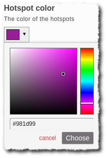
Widget: colorSelector
Description: A visual color selector
Provided by: H5PEditor.ColorSelector
Supported by: text
Screenshot:
Widget: verticalTabs
Description: Makes a list turn into vertical tabs
Provided by: H5PEditor.VerticalTab
Supported by: list
Screenshot (from Question Set):
Widget: wizard
Description: Makes a group turn into a tabbed wizard.
Provided by: H5PEditor.Wizard
Supported by: group
Screenshot (from Drag Question):
Widget: timecode
Description: Makes a number type into a input for timecodes (hours, minutes and seconds)
Provided by: H5PEditor.Timecode
Supported by: number
Widget: duration
Description: Use this widget if you would like to define a time interval (start and end time). It requires two number fields in the group, see example below.
Provided by: H5PEditor.Duration
Supported by: group
Example:
{
  "name": "duration",
  "type": "group",
  "widget": "duration",
  "label": "Display time",
  "importance": "low",
  "fields": [
    {
      "name": "from",
      "type": "number"
    },
    {
      "name": "to",
      "type": "number"
    }
  ]
}
Widget: imageCoordinateSelector
Description: Makes it possible for the author to pick coordinates in an image by clicking the image. An additional parameter is needed to use this widget, that is imageFieldPath, which contains the relative path to an image field. This widget requires the group having two fields with names x an y.
Provided by: H5PEditor.ImageCoordinateSelector
Supported by: group
Example (from Image Hotspots):
{
  "name": "position",
  "type": "group",
  "widget": "imageCoordinateSelector",
  "imageFieldPath": "../../image",
  "label": "Hotspot position",
  "importance": "high",
  "description": "Click on the thumbnail image to place the hotspot",
  "fields": [
    {
      "name": "x",
      "type": "number"
    },
    {
      "name": "y",
      "type": "number"
    }
  ]
}
Widget: linkWidget
Description: A widget helping the author input correct URLs. Splits the URL into two part, one for the protocol and one for the rest.
Provided by: H5PEditor.UrlField
Supported by: group
Example:
{
  "name": "linkWidget",
  "type": "group",
  "widget": "linkWidget",
  "fields": [
    {
      "name": "protocol",
      "type": "select",
      "label": "Protocol",
      "options": [
        {
          "value": "http://",
          "label": "http://"
        },
        {
          "value": "https://",
          "label": "https://"
        },
        {
          "value": "/",
          "label": "(relative)"
        }
      ],
      "default": "http://"
    },
    {
      "name": "url",
      "type": "text",
      "label": "URL"
    }
  ]
}
Screenshot:

Widget: radioGroup
Description: Makes a select type into a group of radio buttons.
Provided by: H5PEditor.RadioGroup
Supported by: select
Example (from True/False Question):
{
  "name": "correct",
  "type": "select",
  "widget": "radioGroup",
  "alignment": "horizontal",
  "label": "Correct answer",
  "importance": "high",
  "options": [
    {
      "value": "true",
      "label": "True"
    },
    {
      "value": "false",
      "label": "False"
    }
  ],
  "default": "true"
}
Screenshot:

Widget: showWhen
Description: Defines conditionally hiding fields based on values on other fields. This widget requires several parameters, look at example below and the github page
Provided by: H5PEditor.ShowWhen
Supported by: All types
Example:
{
  "label": "Max score",
  "name": "maxScore",
  "description": "If set to zero, continue button is displayed initially, and no confirmation is needed",
  "type": "number",
  "default": 0,
  "widget": "showWhen",
  "optional": true,
  "showWhen": {
    "detach": true,
    "rules": [
      {
        "field": "action",
        "equals": [
          "H5P.ImageHotspots",
          "H5P.Blanks"
        ]
      }
    ]
  }
}
Translations
Have a look in the Translating Editor Widgets section.
Comments
tsar
Thu, 11/02/2017 - 06:46
Permalink
Using libraries
can we use the individual audio and video libraries or do we have to use the library semantics. I tried to use the audio library with <audio> and video library with <video> element. For audio its not giving any output and for video its not uploading the video.
if (this.options.video && this.options.video.path) {
$container.append('<video class="container" controls><source src="' + H5P.getPath(this.options.video.path, this.id) + '" type="video/mp4"></video>');
}
I have done this same for audio but it isnt working. can we have an urgent reply? Thanks!
icc
Fri, 11/03/2017 - 09:30
Permalink
I'm not sure I understand
I'm not sure I understand what it is you want to do. Are you creating your own content type and wish to use Audio and Video?
Note that the Audio library will automatically create the audio tag and the Video library will automatically create a video tag, you only need to send in the parameters and attach it to the DOM, H5P.newRunnable() function will help you do this.