Responsive design
Learn how to make your H5P responsive
When creating a responsive design for H5P content there are several issues to take into account. Since H5P content can not assume anything about the frame it is embedded inside, we have to design the content to fit, scale and adapt to any container. The following sections will address some issues that should be taken into account when designing responsive H5P content.
Use relative units of measurements
When styling CSS elements, the designer should strive to define their dimensions in relative units of measurements.
Em is a unit that always is relative to the current font size. Unless you override the font size settings with an absolute unit (such as px or pt ), em will be affected by the user's browser or OS in their device, and thus scale similar to the rest of the content on a web page.
% is also a relative unit and is measured relative to the height or width of the parent element.
Using em and % units when designing h5p content allows your design to adapt to the parent frame on any device, whereas using an absolute unit, such as px does not.
Adjust layout
When the size of the parent container for your content is reduced to a certain point, you might want to move around some of the elements inside. To do this, we must listen for the resize event. This event is triggered every time the window or parent library is resized. Here you can make all the necessary measurements of containers and scale or adapt your content accordingly. Making a standard javascript file for a responsive content type look like the following:
H5P.NewContent = (function ($) {
  /**
   * @class H5P.NewContent
   */
  function C() {
    var self = this;

    // Changes layout responsively when resized
    self.on('resize', function () {
      // Give some constraints for when changes should happen to NewContent
      if (self.$wrapper.width() < 300) {
        // For example, change the layout when parent container is less than 300px
        self.$wrapper.html('Small parent container.');
      }
    });
  };

  /**
   * Attach function called by H5P framework to insert H5P content into
   * page.
   *
   * @param {H5P.jQuery} $container
   */
  C.prototype.attach = function ($container) {
    var self = this;

    if (self.$wrapper === undefined) {
      // Create our wrapper on first attach.
      self.$wrapper = $('<div/>', {
        html: 'Big parent container.'
      });
    }

    // Attach wrapper to container.
    $container.html('').append(self.$wrapper);
  }

  return C;
})(H5P.jQuery);
Content scale with font size
On devices with high resolutions, but small screens, such as most modern mobile phones, the width of the parent container for H5P content can be quite high. However, this does not necessarily mean that we have a lot of space for our content. The space that we have for our content is a relation between the width of the container in pixels, and the font size that the content is described with. For example if we have a lot of width, we might be fooled to think that we have a lot of room for our content, however the font size could be huge to allow people to see the text easily on small devices. In this case, a sentence which we think might cover half the container width could end up covering the whole width of the parent container. The following picture demonstrates how available space in a container shrinks when font size increases and shows the resulting relative container width.

The width of the parent container has to be measured in relation to a context. In most cases this context will be the font-size of the container, and thus the rest of the content on the web page. When we find the relationship between the width of the parent container and the font size of the web page we know the real space that our content can use. To find the width of our parent container in relation to the font size we divide the parent width on the font size of the web page. The resulting value of this is the size of the parent container in Em, using this value you can resize and rearrange the content accordingly. This method is demonstrated in the following example, using the "Drag The Words" content type.
Example: Drag The Words.
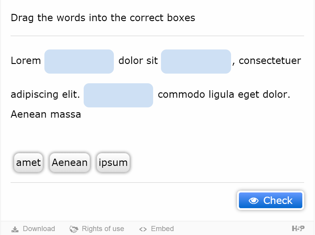
Drag The Words is an H5P content type with a responsive design. Initially the content type will start out with a textarea to the left and a draggable words area in the right area of the screen as shown in the following picture:
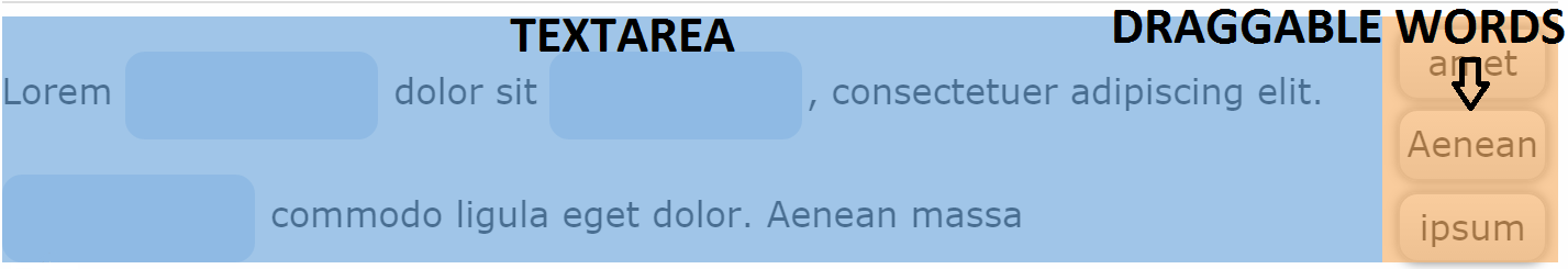
The textarea has a right margin corresponding to the widest draggable word. When one of the words exceeds a set width of 150 pixels or the width of the parent shrinks below 43 em, the draggable words will align to the bottom of the textarea as shown in the next picture:
Following is the function used to change the layout. This function is used inside resize. The different variables used when changing layout are:
- self.$inner - The parent container of Drag The Words
- self.$draggables - The draggable words container
- self.$wordContainer - The textarea container
- self.draggablesArray - An array containing all the draggable words
/**
 * Adds the draggables on the right side of the screen if widescreen is detected.
 */
this.changeLayoutToFitWidth = function () {
  //Find ratio of width to em, and make sure it is less than the predefined ratio.
  if ((this.$inner.width() / parseFloat($("body").css("font-size")) > 43) && (this.widest < 150)) {
    // Adds a class that floats the draggables to the right.
    this.$draggables.addClass('h5p-drag-wide-screen');
    // Detach and reappend the wordContainer so it will fill up the remaining space left by draggables.
    this.$wordContainer.detach().appendTo(this.$taskContainer);
    // Set margin so the wordContainer does not expand when there are no more draggables left.
    this.$wordContainer.css({'margin-right': this.widest});
    // Set all draggables to be blocks
    this.draggablesArray.forEach(function (draggable) {
      draggable.getDraggableElement().addClass('h5p-drag-draggable-wide-screen');
    });
  }
  else {
    // Remove the specific wide screen settings.
    this.$wordContainer.css({'margin-right': 0});
    this.$draggables.removeClass('h5p-drag-wide-screen');
    this.$draggables.detach().appendTo(this.$taskContainer);
    this.draggablesArray.forEach(function (draggable) {
      draggable.getDraggableElement().removeClass('h5p-drag-draggable-wide-screen');
    });
  }
};
If you want to study this case further all our libraries and responsive design are available at GitHub.
You can also read more about why conventional CSS tricks do not apply to H5P content in our "Responsive H5P content" blog post
Comments
ruttoh
Sat, 11/30/2019 - 10:22
Permalink
Hiit's very good tool. How do
Hi
it's very good tool. How do i make hp5 contents be more visible on mobile phone
Thank you
BV52
Mon, 12/02/2019 - 18:33
Permalink
Hi ruttoh,Most H5P contents
Hi ruttoh,
Most H5P contents are designed to be responsive. If are having issues with a specific content on a specific device I suggest that you provide more deatils. I also suggest that you post your question in the forums to make it more visible to the community.
-BV
jasimp
Wed, 06/02/2021 - 10:38
Permalink
interactive video going zoom in while clicking on play buttom
i am facing an issue that the interactive video get zoomed while clicking the play button and all control buttons get hidden
if we reduce the bowser window, or minimize and maximize then its works normally
on firefox browser is fine. but in chorme we face this issue
how to solve this
tried in diffrent ways in css, but still couldnt scceed