Chart Tutorial
Use the Chart content type to present simple statistical data graphically without having to create the charts manually.
Click the "Get started" button to explore all of the possible ways to use H5P!
Example
Here is the content that we will create in this tutorial:
Step 1: Topic
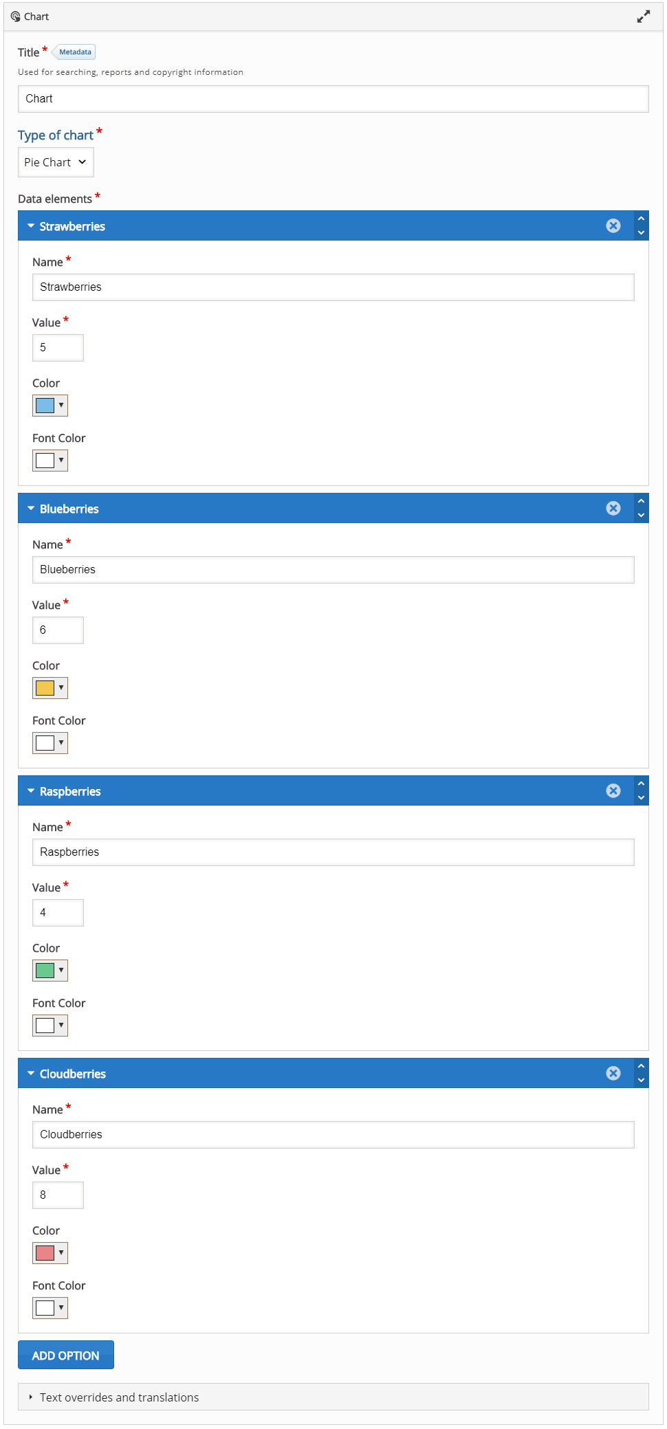
We are going to graphically show the number of berries in the table below. We will use different colors to present each berry type in our chart.
| Strawberries: | 5 |
| Blueberries: | 6 |
| Cloudberries: | 8 |
| Raspberries: | 4 |
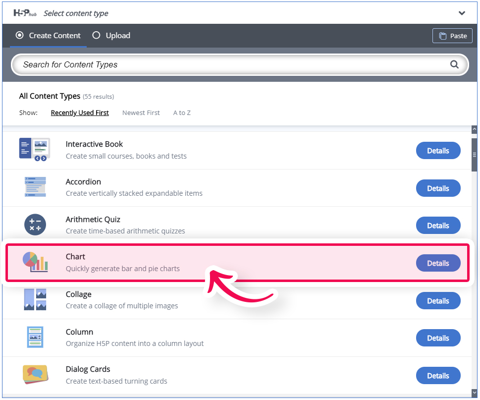
Step 2: Creating a Chart
Select the New content option and choose Chart from the list of Content types:
Step 3: Chart editor
The Chart editor should now appear. The editor looks like this:
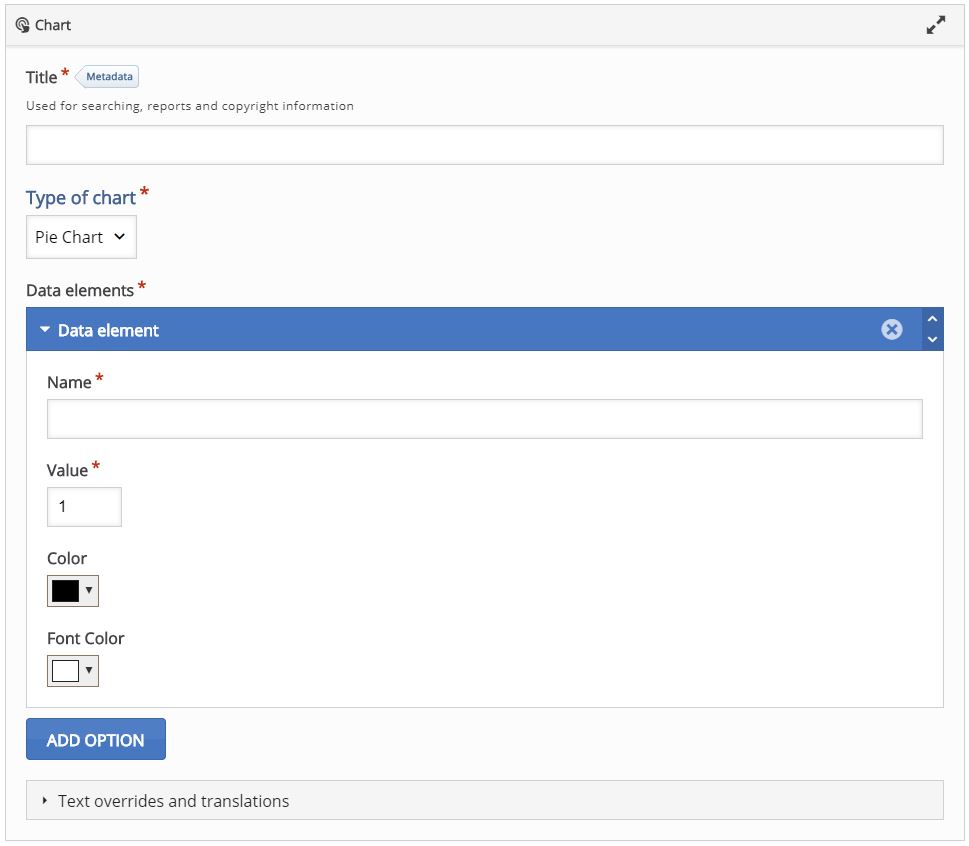
Step 4: Creating Content
Fill in a Title and for Type of chart select "Pie Chart".
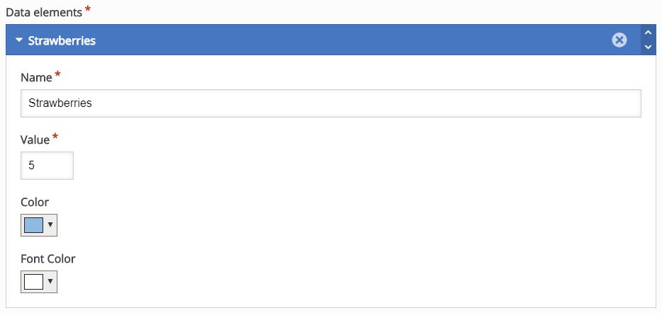
Under "Data elements" we will add our content. Fill in first group like so:
- Name: Strawberries
- Value: 5
- Color: Blue
- Font Color: White
Your 1st data element should look like this:
To add the next "Data element" use the big blue "Add option" button.
Add 3 more items and fill them in with the content from the table above. You can set any background/text color you like. When you are done, you should get the editor looking like this:
Step 5: Finishing up
Save the node/article to view your finished Chart.
You should now have the same result as the example at the top of this page.
Step 6: Optionally (Chart type)
At any point, you can switch your chart type, just select Type of chart and pick "Bar Chart". Your content will now be displayed as a Bar chart and it should look like this:

Feel free to leave any comments or suggestions on how to improve this tutorial.
Comments
duncan.mcmillan...
Thu, 10/15/2020 - 22:18
Permalink
Charts
I was wondering if there was a way that I could have a chart creator that I could put on my course moodle page and students could input their own data and get an individualised chart that corresponds to their data.
BV52
Fri, 10/16/2020 - 18:05
Permalink
Hi,This is not possible not
Hi,
This is not possible not unless you give them access to creating contents.
-BV